Project Description
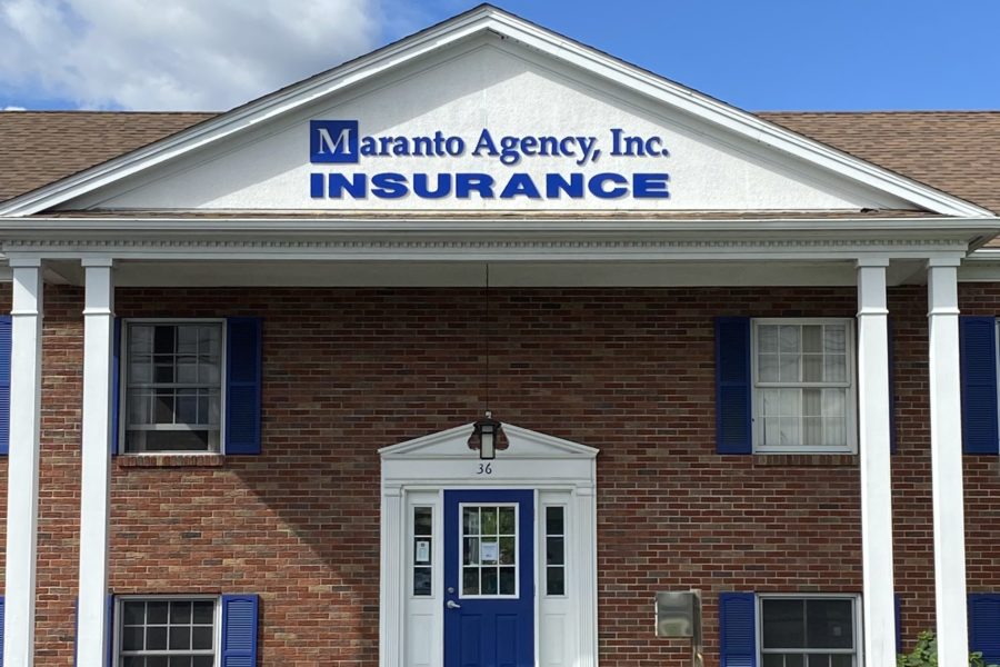
These dimensional letters for Maranto Insurance Agency turned out great! After removing the old letters and getting dimensions a few weeks ago, the facade was repaired and ready for the new letters to be installed. The company logo “M” is cleverly worked into the name, and executed perfectly in the dimensional lettering. The company blue was color matched to perfection, and compliments the blue door and shutters around the building. This building has a very clean and professional look to it, and with their new signage, they are ready to attract more business!

